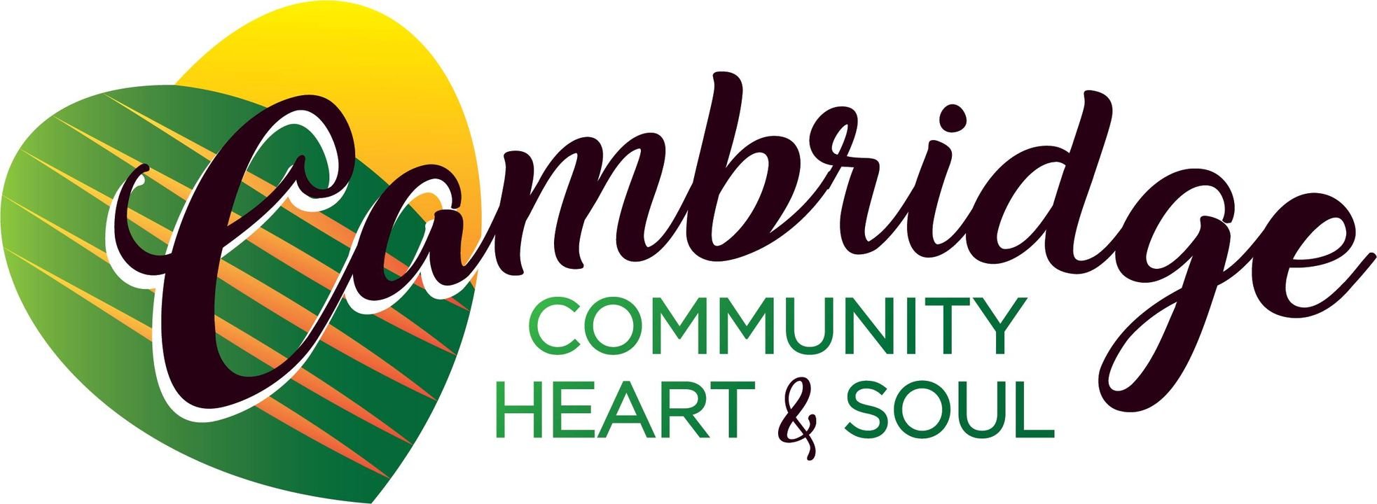
Hey Cambridge! Meet our new logo.
Nice, right?
Did you know that it’s so much more than ‘just’ a logo? It’s the door to a whole visual identity system designed to represent our community and our values.
Let’s explore what our new logo means and what inspired it, what the process was in arriving at the solution, and how it can work in context.
Our community values the character and friendliness of Cambridge, which allows people to easily connect with one another. Cambridge’s previous logo focused on the city as the county seat and didn’t represent our community or our values.
We set out to create a visual identity that represents Cambridge and the surrounding rural area as “a great place to live and visit.”
The result showcases the tight knit, community-driven spirit of Cambridge, while emitting a sense of energy and optimism to all who interact with it.
Logo Elements
Sunrise
Letter “C”
Fields
This circular mark depicts a sunrise over abstract farm land. It is a hopeful, welcoming image that ties to the values and Midwest geography of Cambridge. The letter “C” can be seen within the mark, further adding its relevance to our community.
Key points:
There are 5 rays of sun—each representing the 5 Community Heart and Soul attributes.
The sunrise is symbolic of birth, growth, and new beginnings of all kinds—perfect for a community that welcomes newcomers and actively enriches the lives of those living in Cambridge.
The field symbolizes Midwest values and agricultural roots, growth, fertility, abundance, and hard work.
Logo Variations
The Cambridge logo is more than a singular mark in a single color — it’s a system of marks that can be used to represent our community in various contexts.
Primary Logo shown on white background
Secondary Logo shown on dark background
Badge Logo shown on dark background
Icon shown on light background
How’d we get here?
First
It started with an audit of our community’s values and goals — “Cambridge is a great place to live and visit.” We defined a list of key nouns with our designer to help guide the creation of our logo.
Key Nouns
Agriculture, Friendliness, Inclusiveness, Bright Future, Nature, Education/Youth
Next
Our designer set out creating dozens of sketches which were then narrowed and refined into more precise concepts for consideration.
A sampling of rough logo concept sketches
Lastly
After the narrowed concepts were refined, our committee narrowed the concept selection even further down to three options. These options were fleshed out into more complete graphic packages from which the final logo was chosen.
So how does this new visual identity work?
As mentioned earlier, our visual identity is more than just the logo. It consists of a complete color palette, fonts, icons and graphic elements that work together to communicate our community’s values.
Below is a sampling of these elements and some examples of how they can work together. This website is the perfect example of how our visual identity works together to represent Cambridge.
Support Graphic Overview
The primary graphic element is derived from the farm field illustration in the icon. It can be used as a repeating pattern or simplified to resemble two hills. The element creates a horizon and a sense of future forward thinking.
Color Palette & Icon Style
Cambridge’s primary color palette is derived from the logo while our secondary colors correlate with Community Heart & Soul values.
Local Parks
Historic Downtown
Schools
Local Business & Agriculture
Small Town Feel
How can this work in context?
Aside from this website, Cambridge’s visual identity can extend into a variety of real-world applications. Below are some examples of how it can work.
Please note that these are just mocked-up examples to illustrate our identity system and have not actually been produced.


